
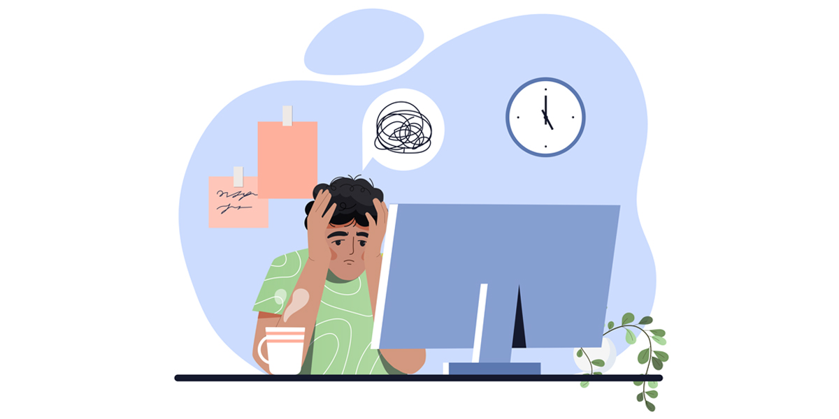
Winter is often a time for reflection on the year that has gone by, with both successes and the bumps in the road found along the way.
Over the past two years, in particular, the work of a branding and design agency has changed to fit how brands, businesses and people, in general, have changed as well, and due to the somewhat radical nature of these changes, some brands fared better than others.
Here are some infamous examples of failed rebrands, and the lessons we can learn from them as we head into the new year.
The Million Dollar Pepsi Smile
Pepsi, one of the biggest soft drink companies in the world, have tried to reinvent themselves a few times, although their most radical redesign came with a $1m rebrand in 2008 that saw the red and blue wave replaced with a rather odd half-smile and lower case font.
There were a lot of problems with it. The design broke the golden rule of logo design: it should be consistent across all media. Often the white stripe, meant to resemble a smile would change shape and size depending on the product.
It also bore a striking resemblance to two other logos: the old Diet Pepsi logo and the logo for Barack Obama’s presidential campaign.
The lesson here is that whilst the aim to make a minimalist logo was sound, they did not need to change much besides simplifying the lines and removing the typography, retaining core elements that people already knew.
The Six-Day Logo
The Gap’s logo has remained largely consistent since 1986, with the iconic narrow serif font and blue box being striking, minimalist and very effective during the brand’s most successful period in the 1990s.
The logo would last 30 years, except for six days in October 2010, when the company made a huge mistake by suddenly debuting a new logo, with the blue square becoming a smaller gradient element at the end and the serif font replaced by Helvetica.
The design community, as well as fans of the brand, hated it and due to a huge negative campaign, the $100m logo was scrapped in place of the old one.
Several lessons thankfully were learned in this case. The first is to understand the audience. The logo represented nothing and if people did not know the brand would not in any way reflect a clothing company. People had a connection to the blue box and what it represented.
It was also too radical a change, and it would turn out would be the result of crowdsourcing, which led to everything changing. The Gap would later try a far more subtle rebrand in 2016 that was far more versatile, retained the serif font and was much better received.
Finally, going back on a disaster is a symbol of strength, not weakness. The Gap wisely avoided a protracted crisis and managed to generate some expensive attention.
The Shack Is A Little Old Place
Some companies rebrand seemingly out of shame for the business they are and want to become something very different, which led to Radio Shack attempting a $200m rebranding campaign to become The Shack.
It was embarrassing, capped off with the terribly 2000s tagline of “Our friends call us The Shack” that failed to attract the new customer base Radio Shack desperately wanted.
The problem was that existing customers felt ignored and alienated by the desperate attempt to be cool after building a reputation as technical experts and a haven for inventors and tinkerers, and given that their previous inventory of electronic parts was sidelined meant that customers had no reason to go.
Ultimately, the biggest lesson, one for both business and life is to be yourself and embrace your core audience, as they will stay with you through good and bad times if you treat them right.