Asda asked us to help deliver a better performing entry level range, to capture shoppers looking for their favourite well priced varietal. Now award winning and 11 wines strong, we gave it a name and bold graphic style to communicate great quality and value in every drop! Each wine features an ode to the grape and bespoke colourway to help you pick the perfect style!
Winemaker’s Choice
A clean and elegant solution for a range of entry level German wines. using Fraktur handcrafted typography and unique Germanic heraldry, the range has seen an upturn in sales.
Asquith Gardens
A floral and premium look for this stylish English sparkling. The floral nature and iconography was inspired by the work of Charles Rennie Mackintosh.
Yellowwood
A once much loved South African range in need of a dramatic modern refresh to uplift sales and to better bring to life the trademarked name.
La Corriente
When you can’t get your hands on New Zealand Sauvignon, can we make Chilean look just as appealing? Of course!
A bold disruptive take on the sea-of-same, Chilean white labels. The Humboldt current – or La Corriente as it is known locally – helps to cool the vineyards and bring the life and vibrancy that Chilean Sauvignon Blanc is known for.
Mirabello
Iconic Italian wines deserve iconic style treatments. A beautiful and elegant simplicity underpins this classic on-trade range.
Heroing famous insignia from Pavia’s rich history and landmarks, picked out with premium finishes, these symbols of the city look gorgeous in any ice bucket.
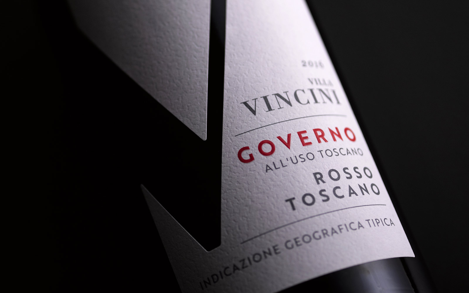
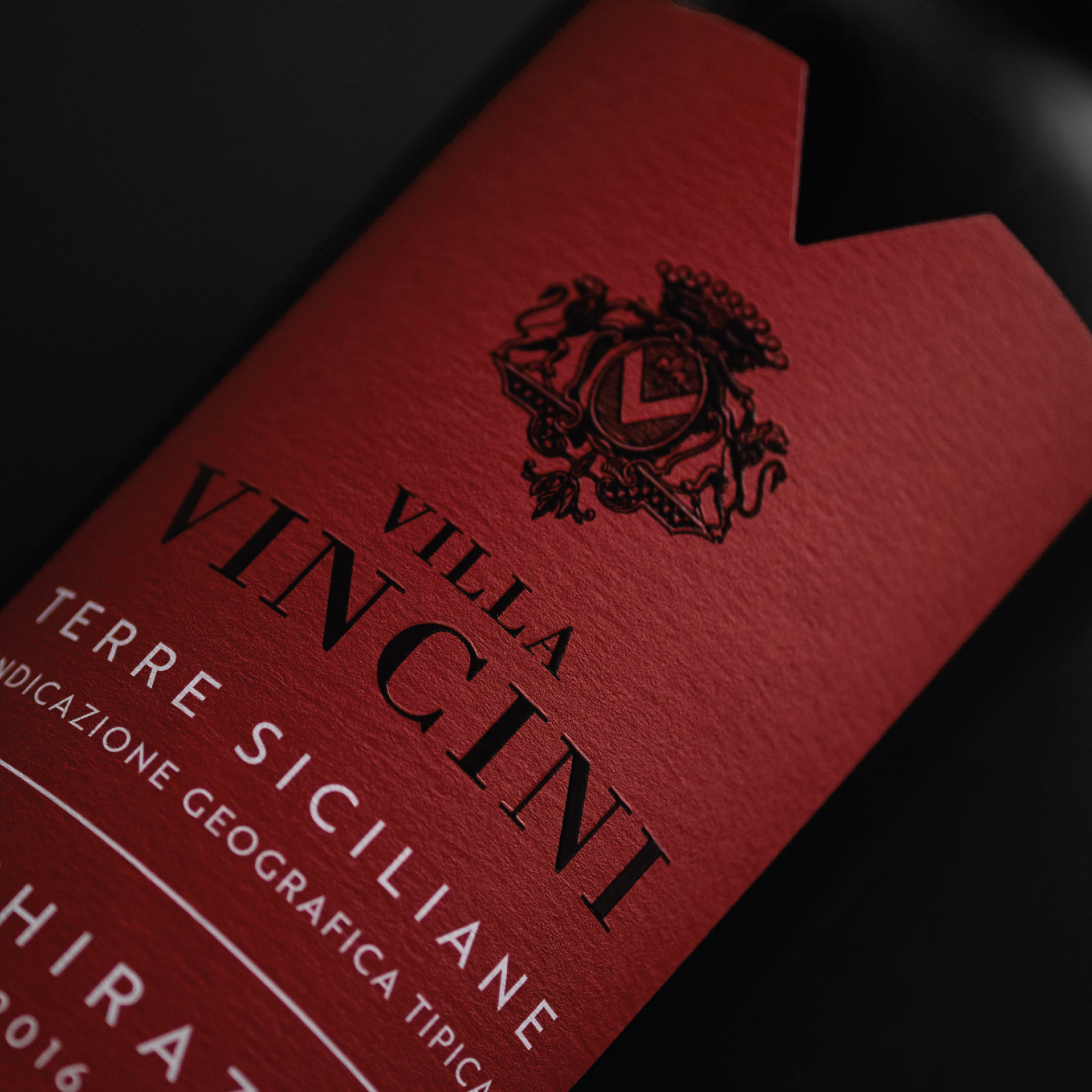
Villa Vincini
Providing synergy to the brand’s multiple varietals and various price points was key to building the success of this ailing brand, along with providing the necessary vehicle to allow more premium wines to be introduced.
The hierarchy of messaging, colours, print finishes and label stock were carefully considered to help define each tier’s positioning and labels were crafted to ensure familiarity with previous designs to avoid alienating current consumers.
Whale Watcher
Inspired by the fishermen of Arapawa, who navigate the water valleys of the Marlborough Sounds on the look out for the Whale’s majestic tail. For in its wake, shoals of silver fish follow!
Our hand drawn ink illustration injects energy into the maritime scene, with a simple pop of aquamarine type to reflect the fresh citrussy nature of the wine.
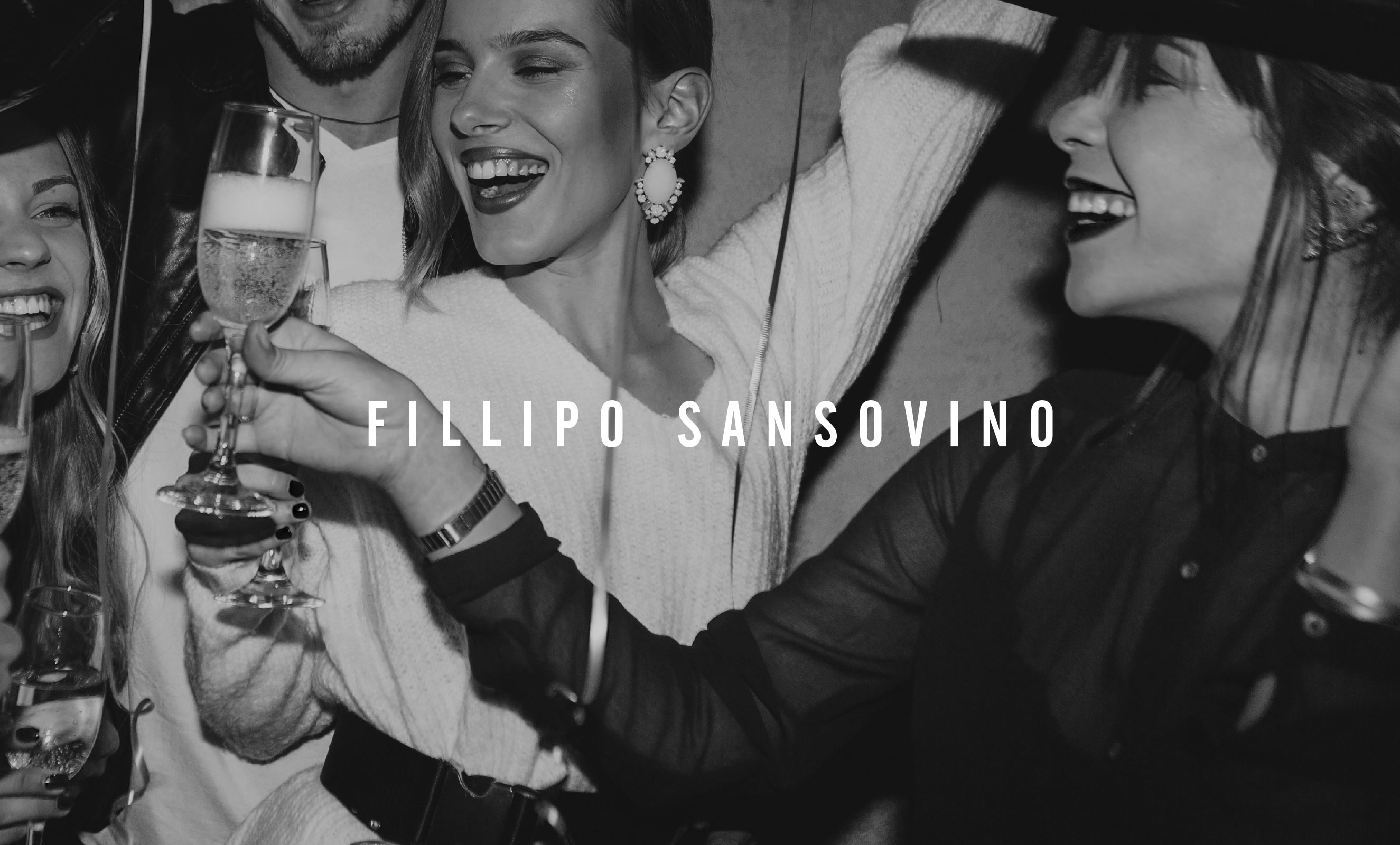
Fillipo Sansovino
We created a stylish and premium execution for the Valdobbiadene Prosecco to marry into the hugely successful Fillipo Sansovino range.
El Ninot
A characterful Spanish house blend specifically made for bars and restaurants, in need of a stand out creative to match. Both our eye-catching design and ‘El Ninot de Paper’ name were inspired by ‘the paper doll’ festival held every year in Valencia – where puppets with huge paper-mâché heads are paraded around the city streets. Bold colour and screen print effect echo the festivities and ensure it’s now a standout on-trade choice.
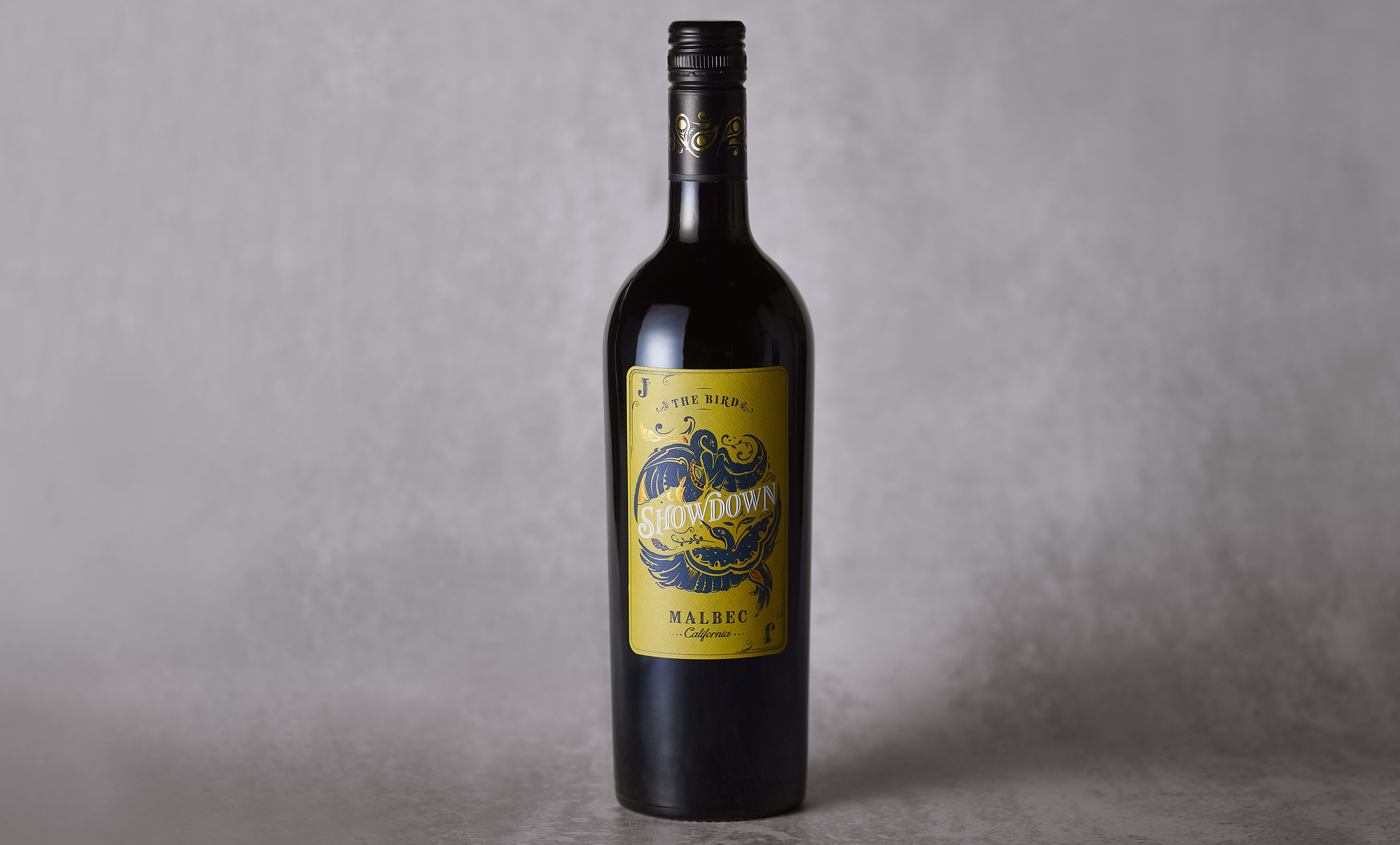
Showdown
An opportunity to bring an American twist to a traditionally Argentinean varietal for UK independent wine shops. Named after the showing of cards at the end of a poker game and the nickname for the joker of the pack – ‘the bird’. This wine is a beautiful example of our inhouse illustration abilities with everything laddered back to the playing card theme, from label shape, size to diamond texture substrate and a bold colour palette. Deal us another round.
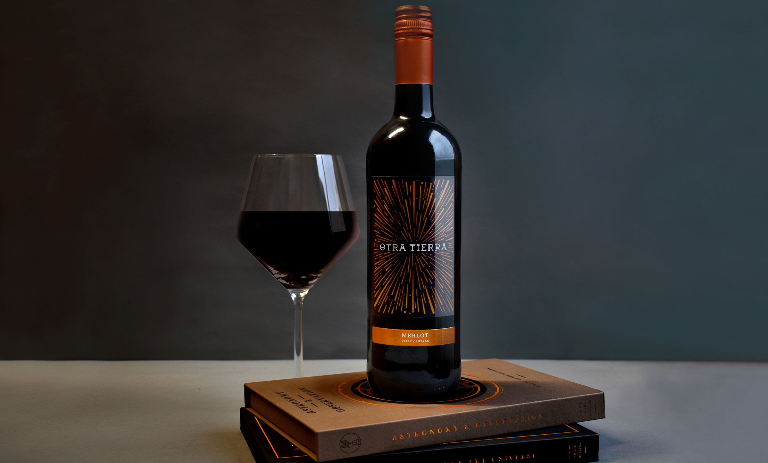
Otra Tierra
Meaning ‘another world’ we looked to the stars to redesign this pair of Chliean wines.
World famous for its crystal clear skies, the Attacama desert is star gazing heaven and this area provided inspiration for the creative. Stars and planets rush past in bronze foils used to catch the light around the centred Otra Tierra font.
The typography was crafted to represent the Mapuche writing, from the indigenous people of Chile. It reinforces provenance and its uniqueness to provide stand out for the on-trade.